Filmmaker Magazine.
Editorial / Typography
Project Brief.
Redesign a magazine using grid structures, sequential typography across multiple pages and formats, and combination of expressive and functional type.
Refining the Idea.
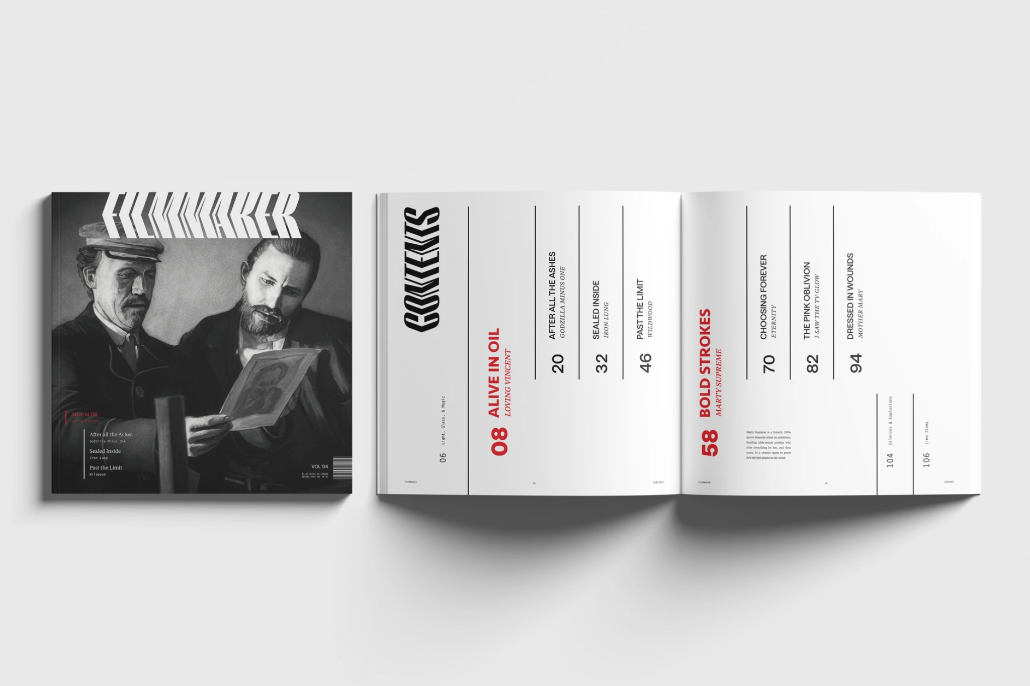
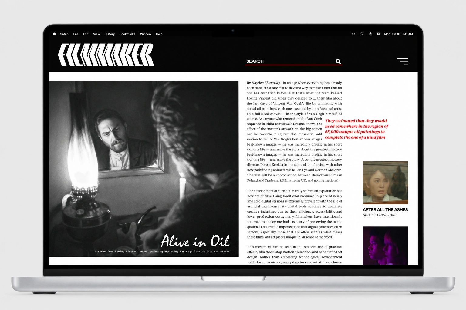
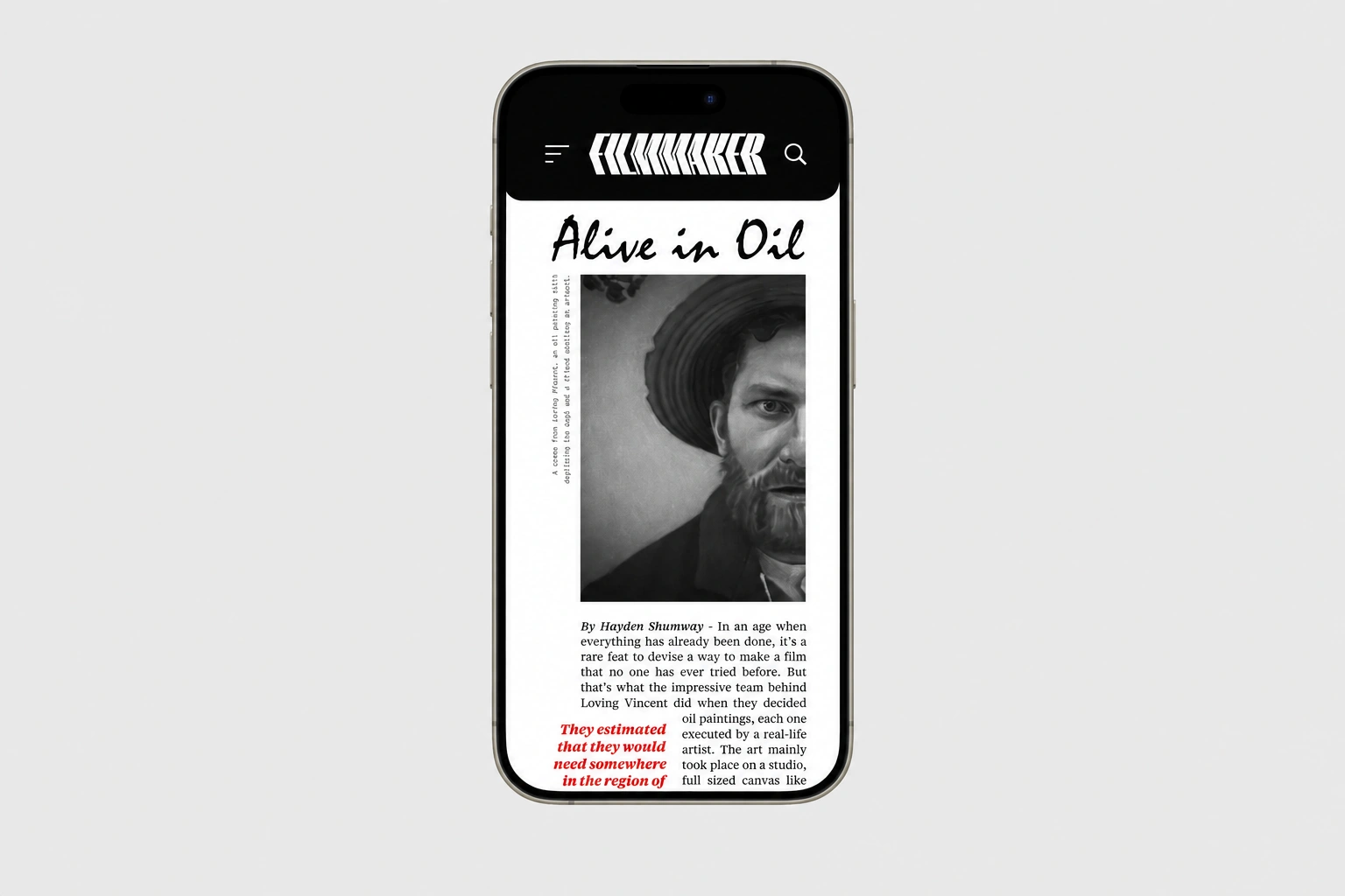
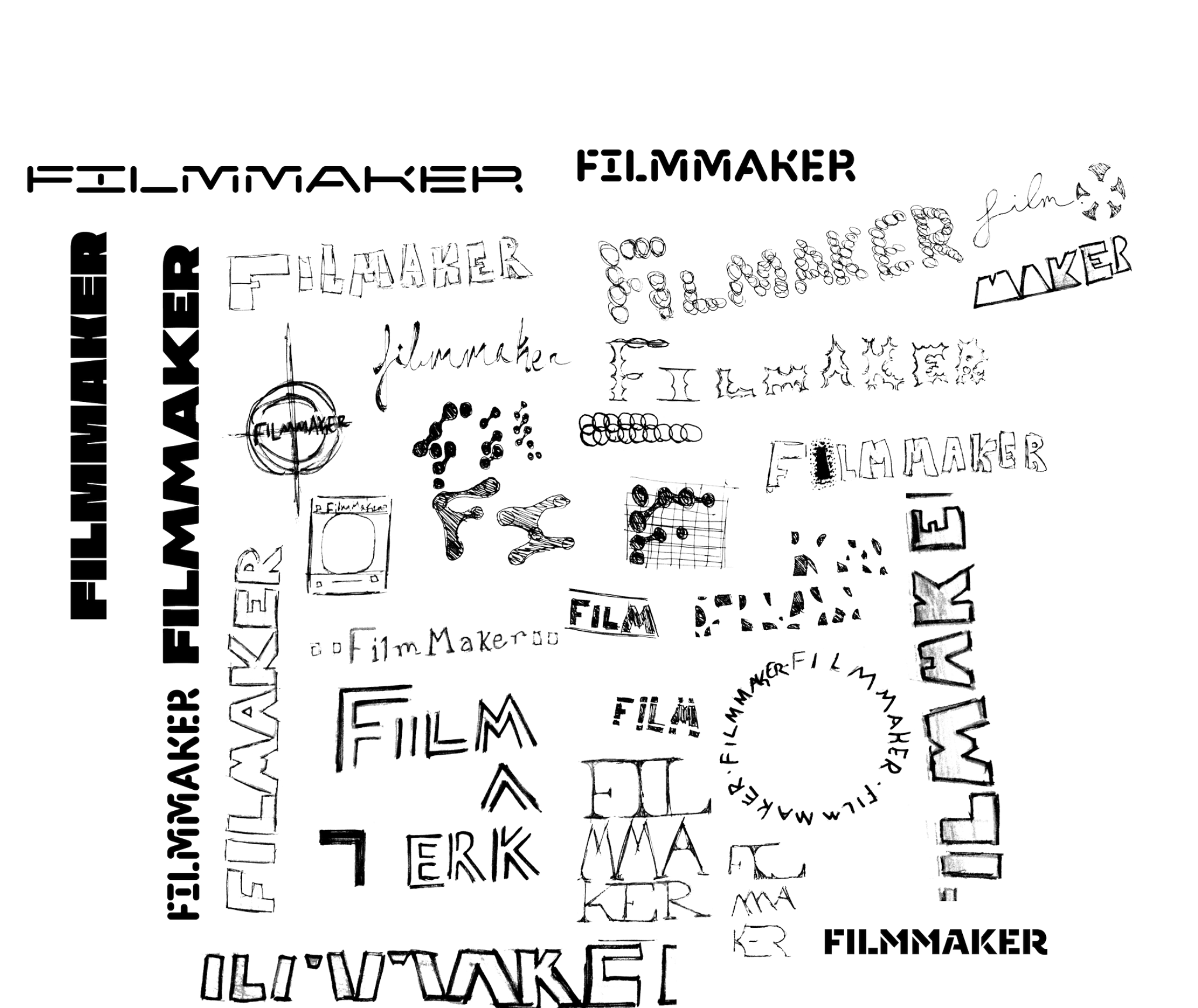
Being a magazine based around indie film creation, I really wanted to embody aspects of film within the magazine. This lead to me ideating about ways to represent such a magazine through the masthead without it being overly obvious. I ultimately decided on using a modified Workhorse Empire Fold font, modifying the K to be more cohesive with the other letterforms. This then was a way to allude to the film slate, or "clapper", through the masthead.
Developing the Imagery.
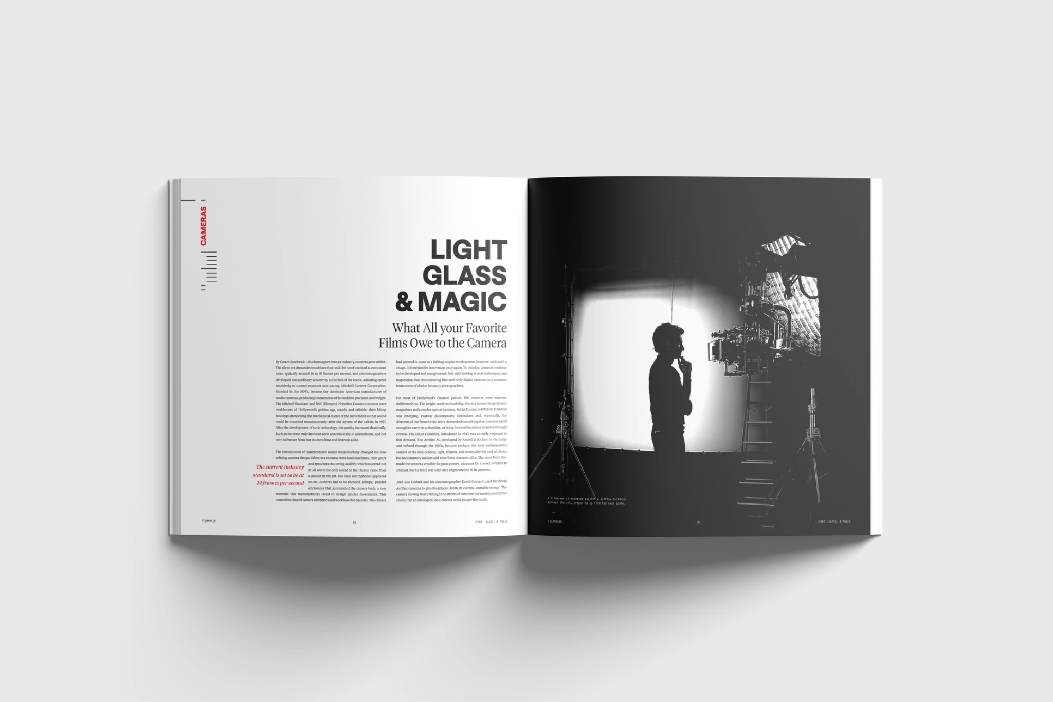
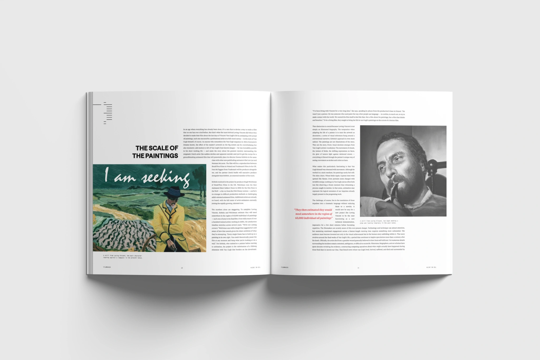
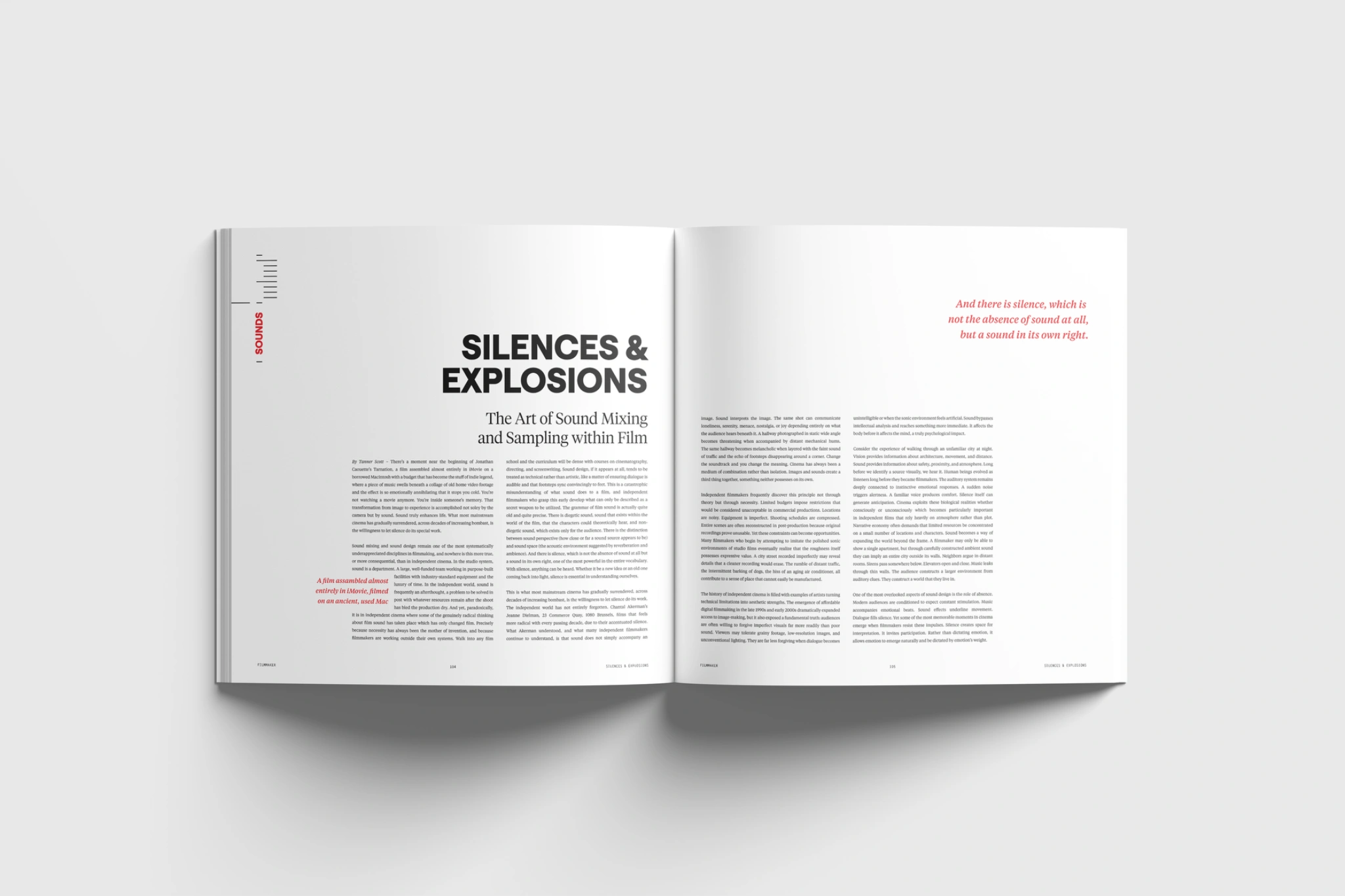
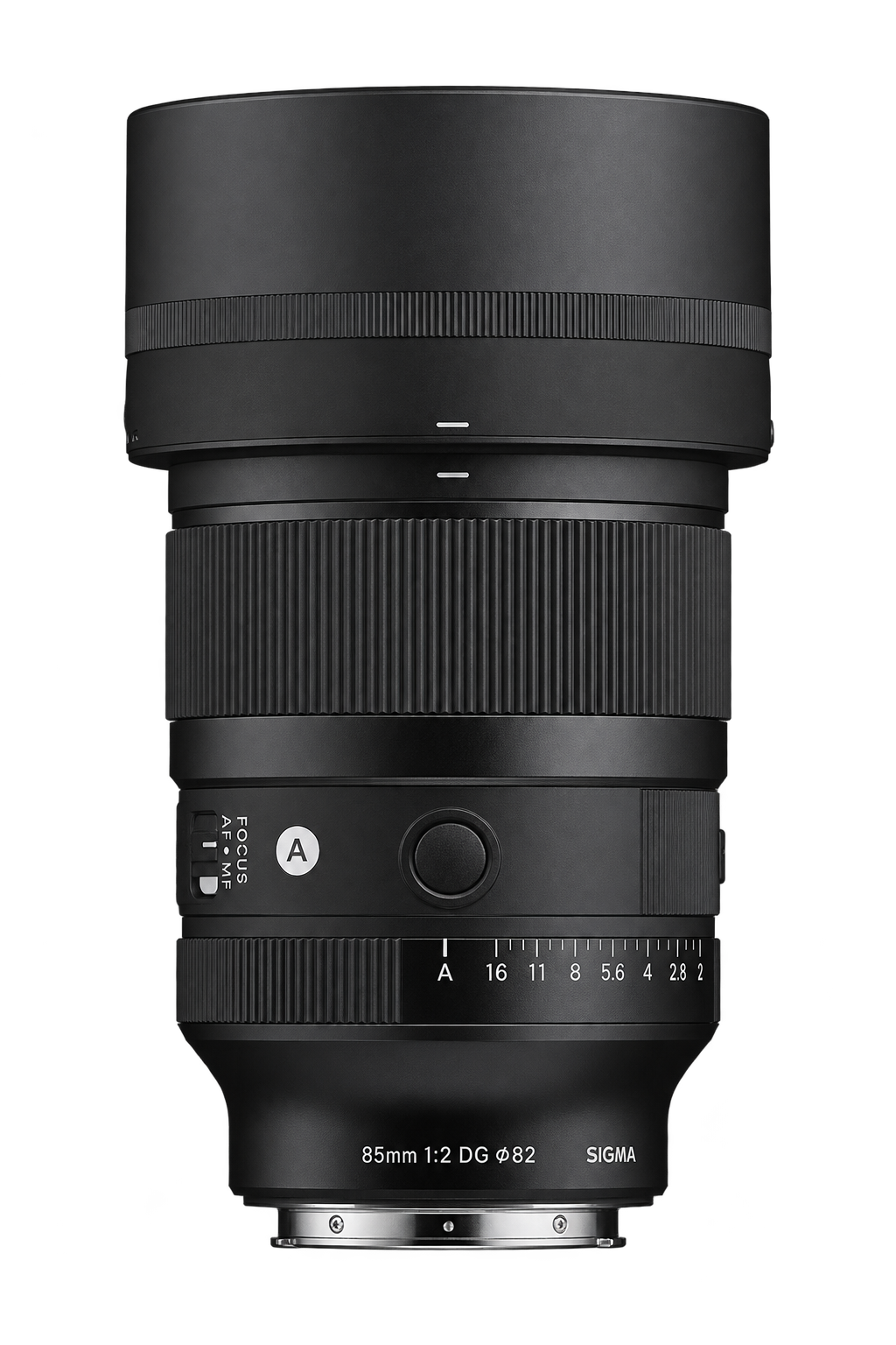
Besides the masthead, I decided to use the zoom index marks on a camera as a point of inspiration. Developing a running tab system that is used as a progressional marker for the magazine allowed for the small markings of the zoom index to become much more. This system then became the basis for the contents page, allowing for a distinctual indentation between features, sub-features, and department. It was then given ample space within the spreads to maintain a luxury feel within the publication while allowing for a continuation of the developed system.
Defining the System.
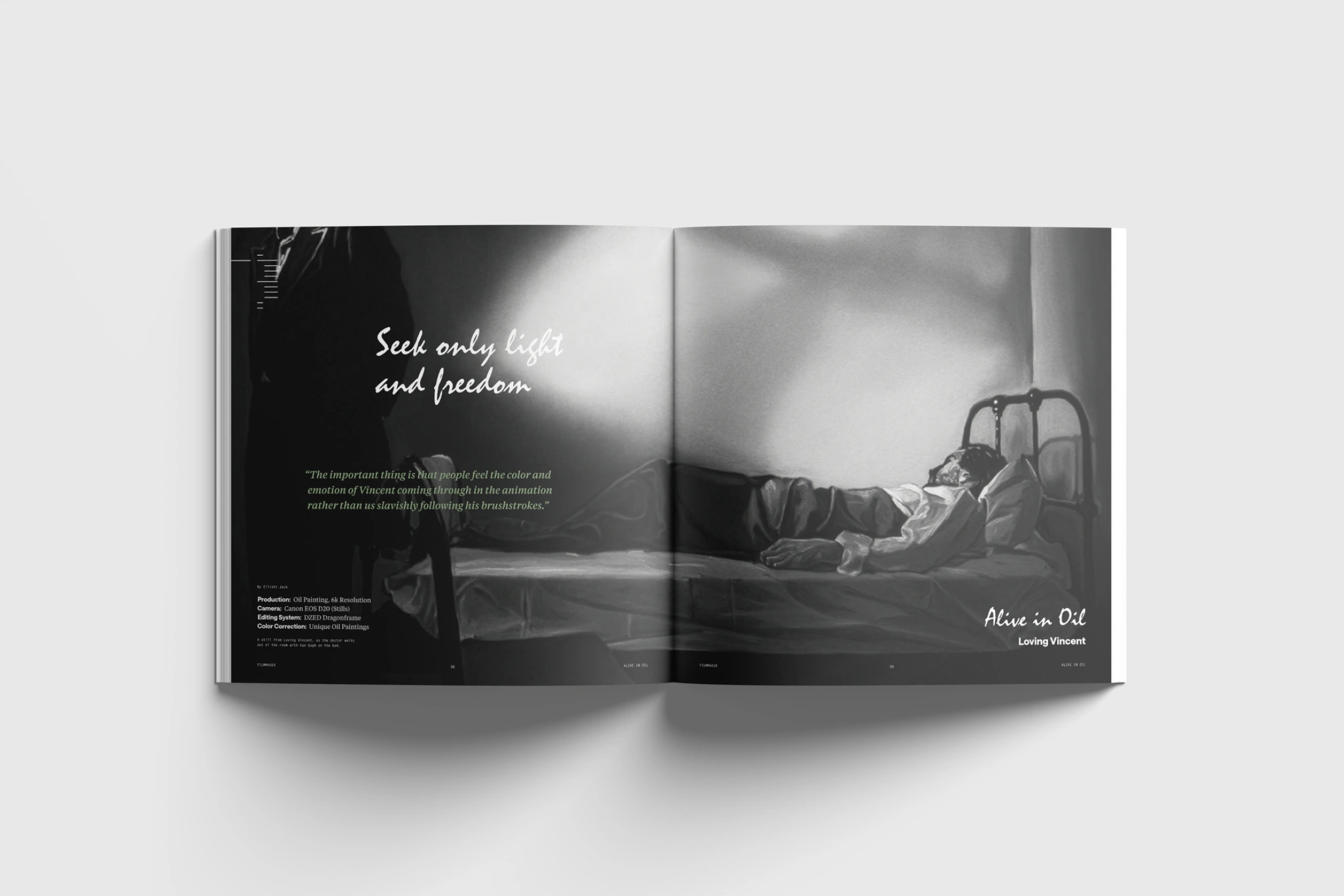
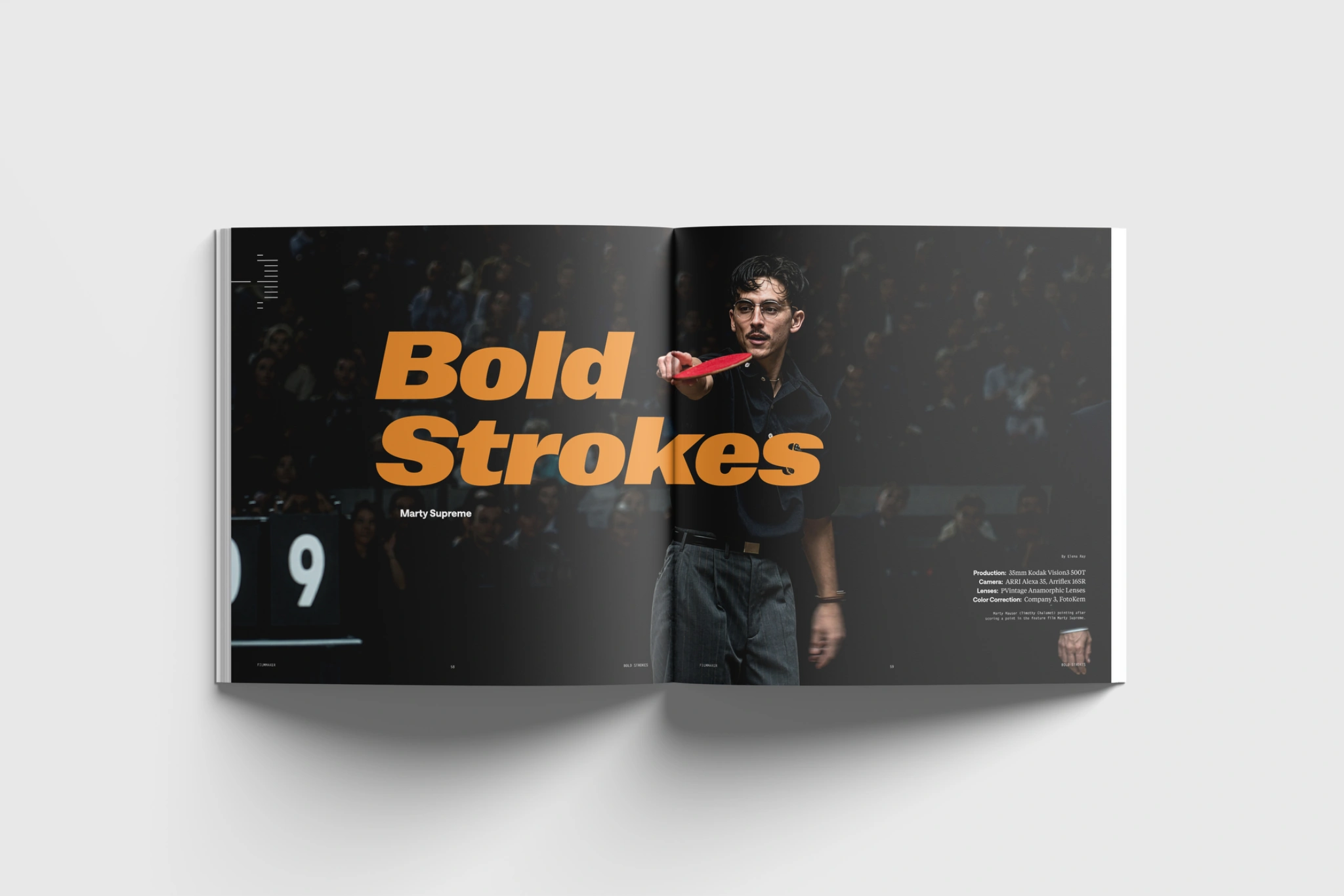
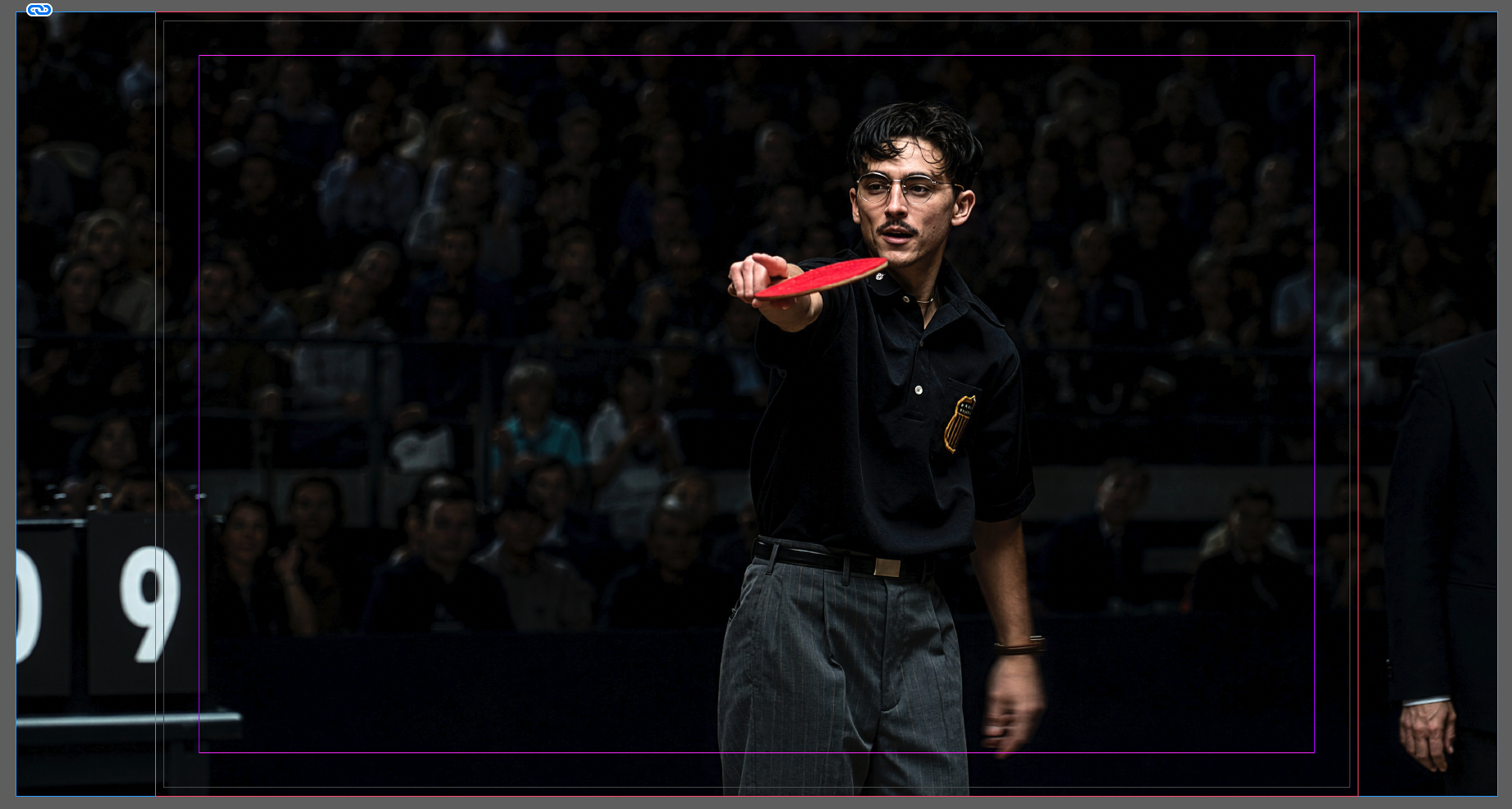
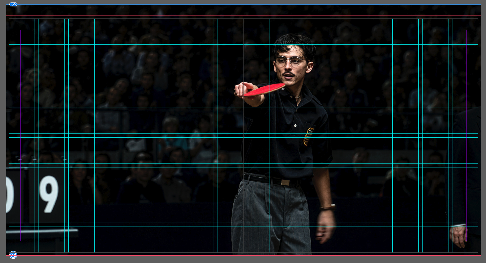
The most impactful part of this project was when I decided to make a monumental, last minute, shift in my layout. I noticed that the 17x11in spread that I was designing was resulting in either the loss of the majority of the film still or creating uncomfortable spacing that was hard to fill, or leave as is, without becoming a major point of distraction. This drove me to redesign the magazine to meet a 10x10in layout. This change allowed for the majority of the still to be present within the spread without losing context; a change that was quintessential in the formation of what I redesigned Filmmaker to become.