Gato Negro Wine.
Packaging / Label Design
Project Brief.
Create new branding/package series for a line of food products. Visually articulate the specific design attributes of the brand and create an interrelated design solution, connecting the design to a brand family/series.
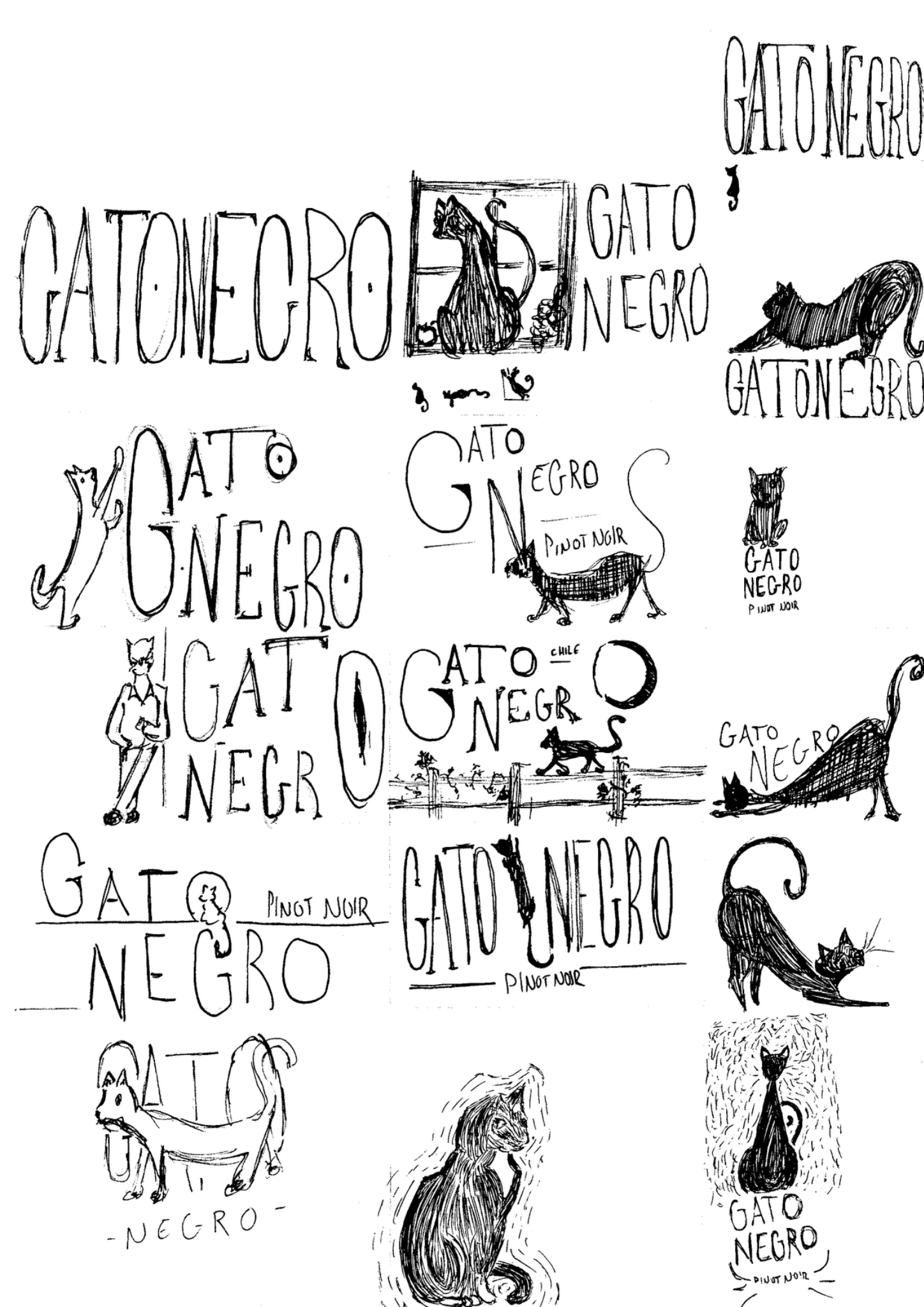
Refining the Idea.
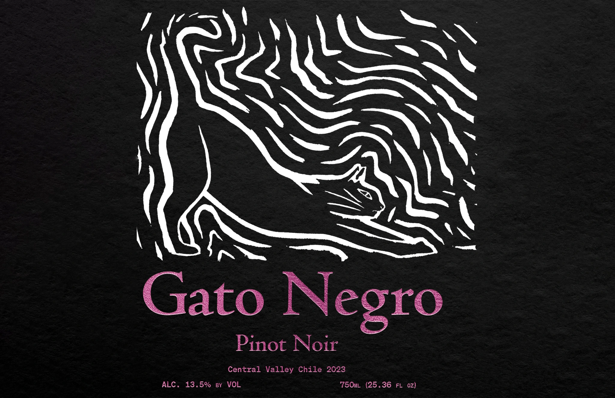
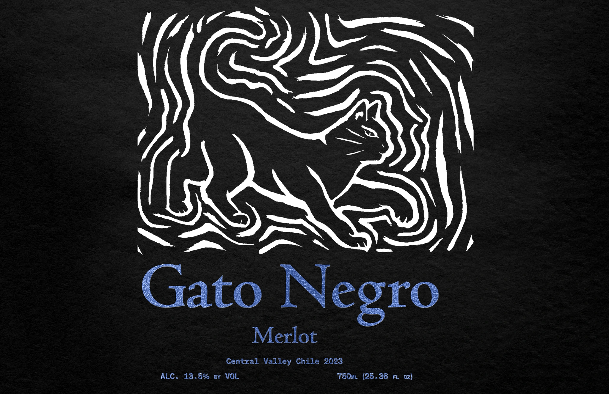
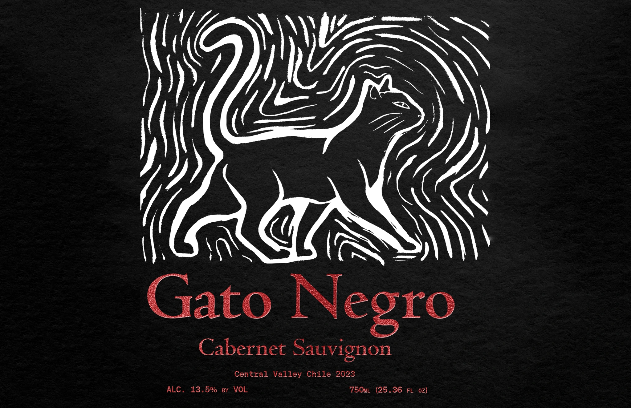
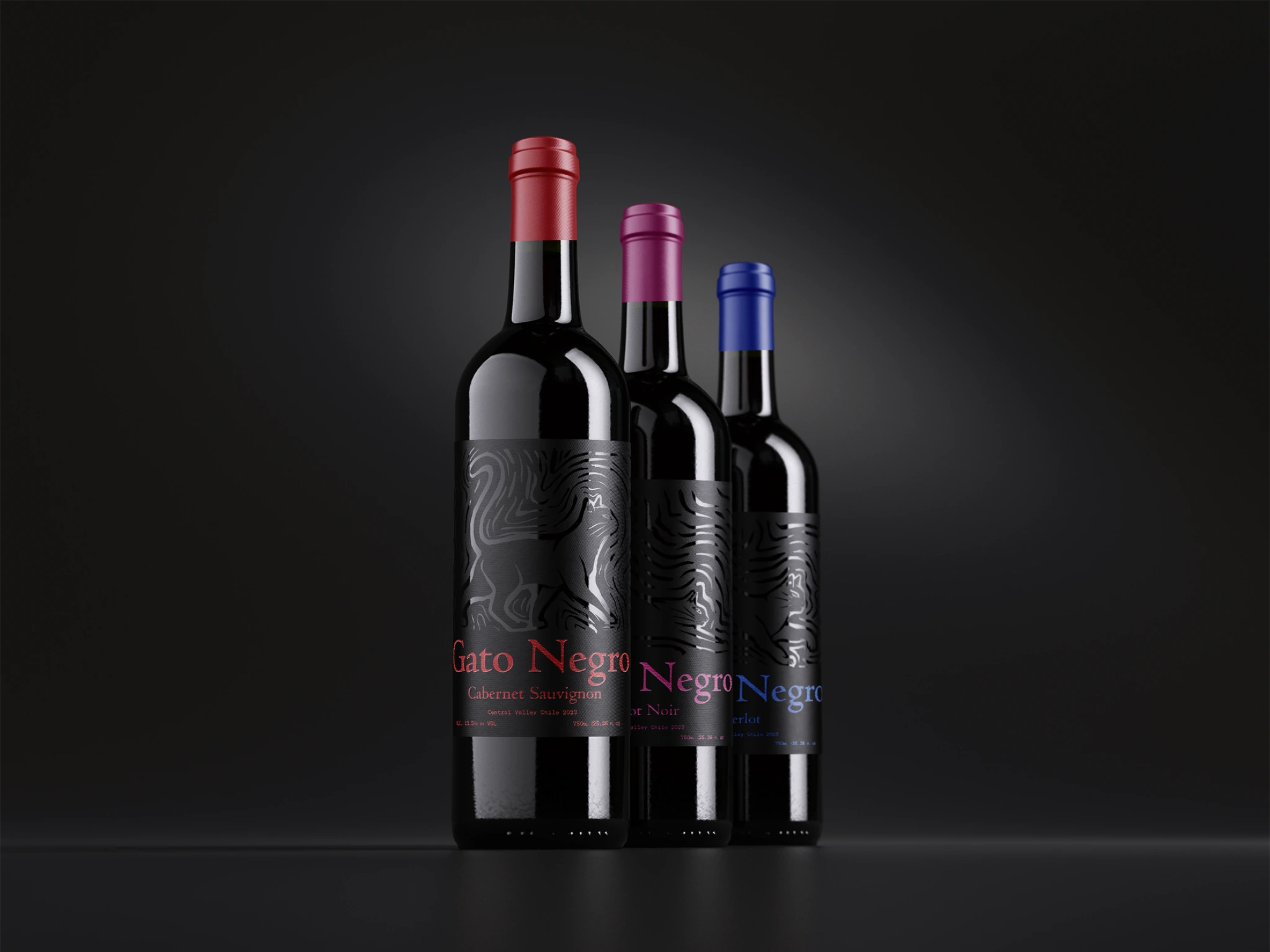
Gato Negro, meaning “Black Cat” in Spanish, is a wine label coming from central Chile, where I served my mission. Being surrounded by this packaging daily it quickly came to my mind when thinking of what I could redesign. Being a fairly commonplace wine in Chile, I wanted to add an element of elegance in its design, especially using a physical medium such as linocut.
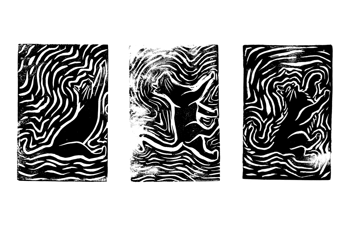
Developing the Imagery.
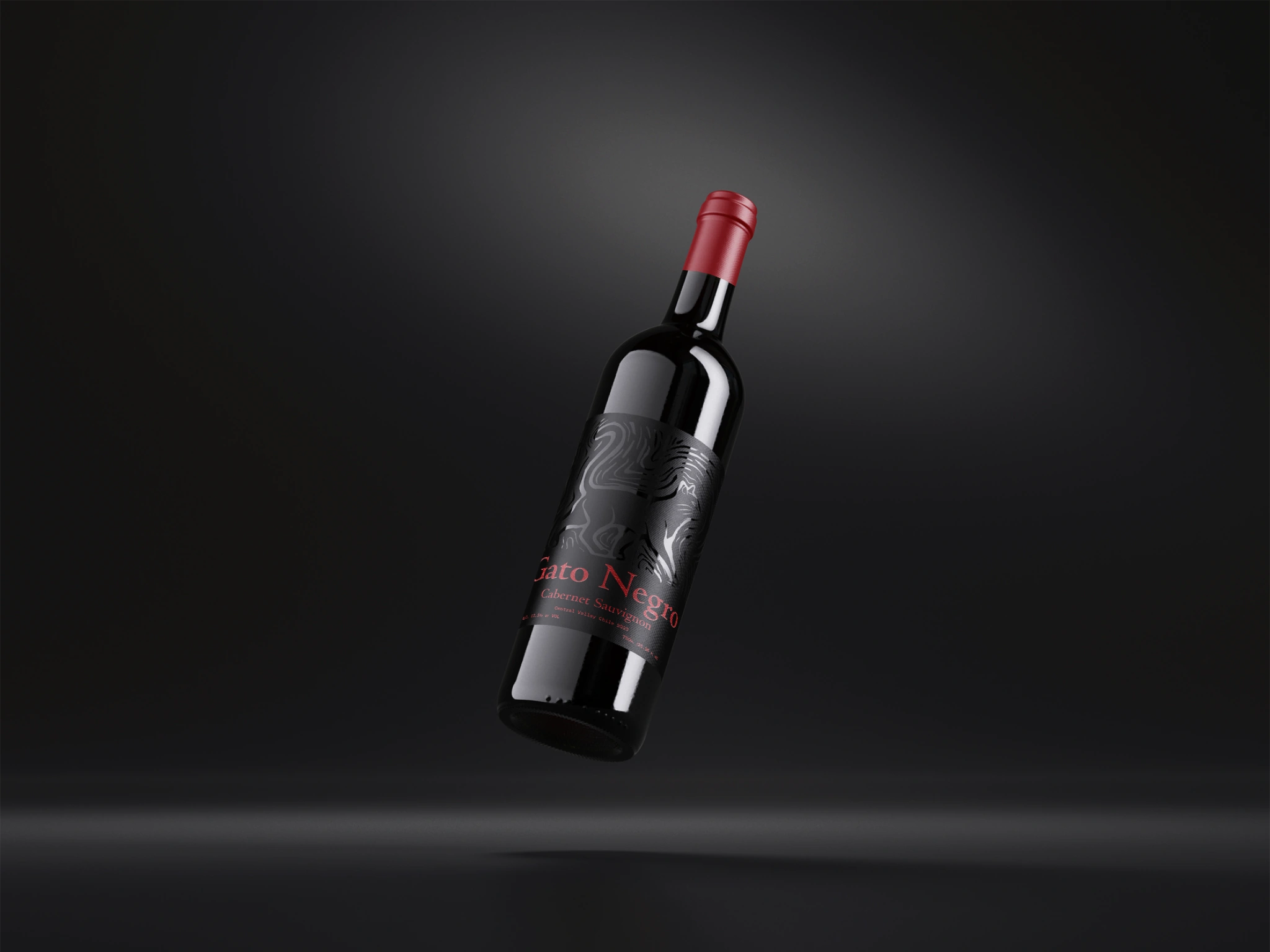
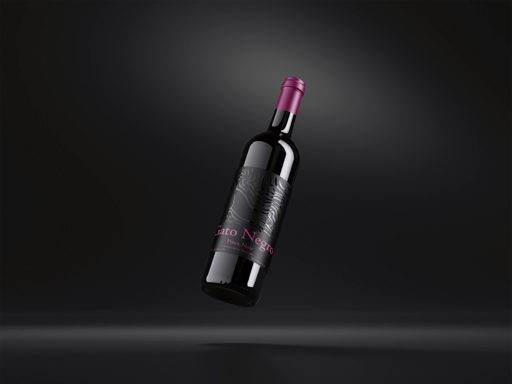
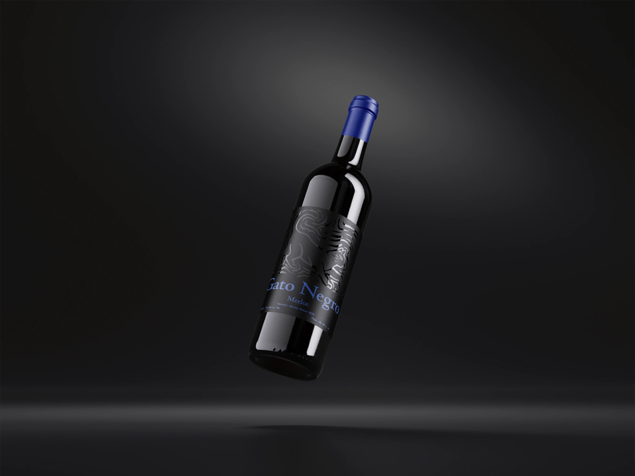
Then I worked towards the development of the Linocut figures, working on matching the structures of the cats to the flavor profiles of the wines: Silky and delicate for Pinot Noir, structured and firm for Cabernet Sauvignon, and round and plush for Merlot.
Final Product.
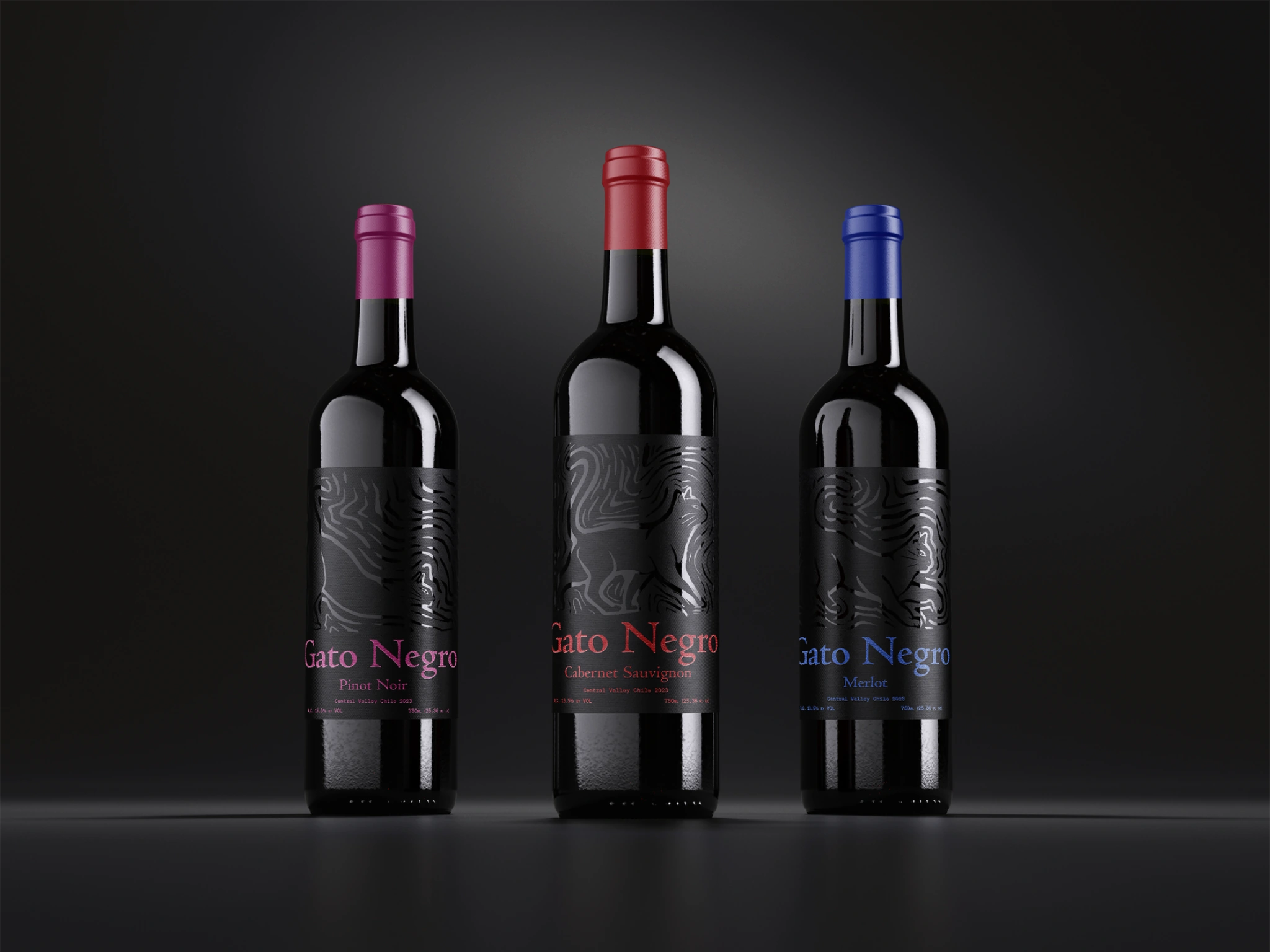
After developing and making slight edits to the linocut imagery, I landed on a black-on-black design, with colored text that matches the original colors of the flavor profiles and matches the neck wrapping. Using a humanist font contrasted by a monospace font for the micro-aesthetics.