Mused.
User Interface / App Design
Project Brief.
Design an app to solve a real world problems by researching and understanding the User’s needs. Expand on these problems to find the root cause and help solve it.
Refining the Idea.
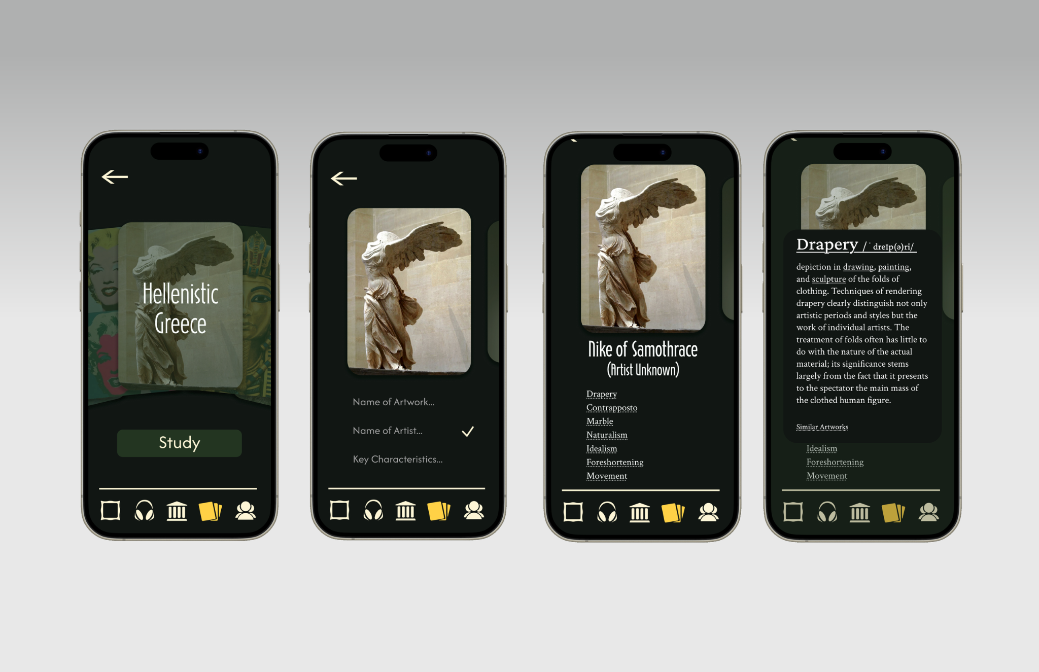
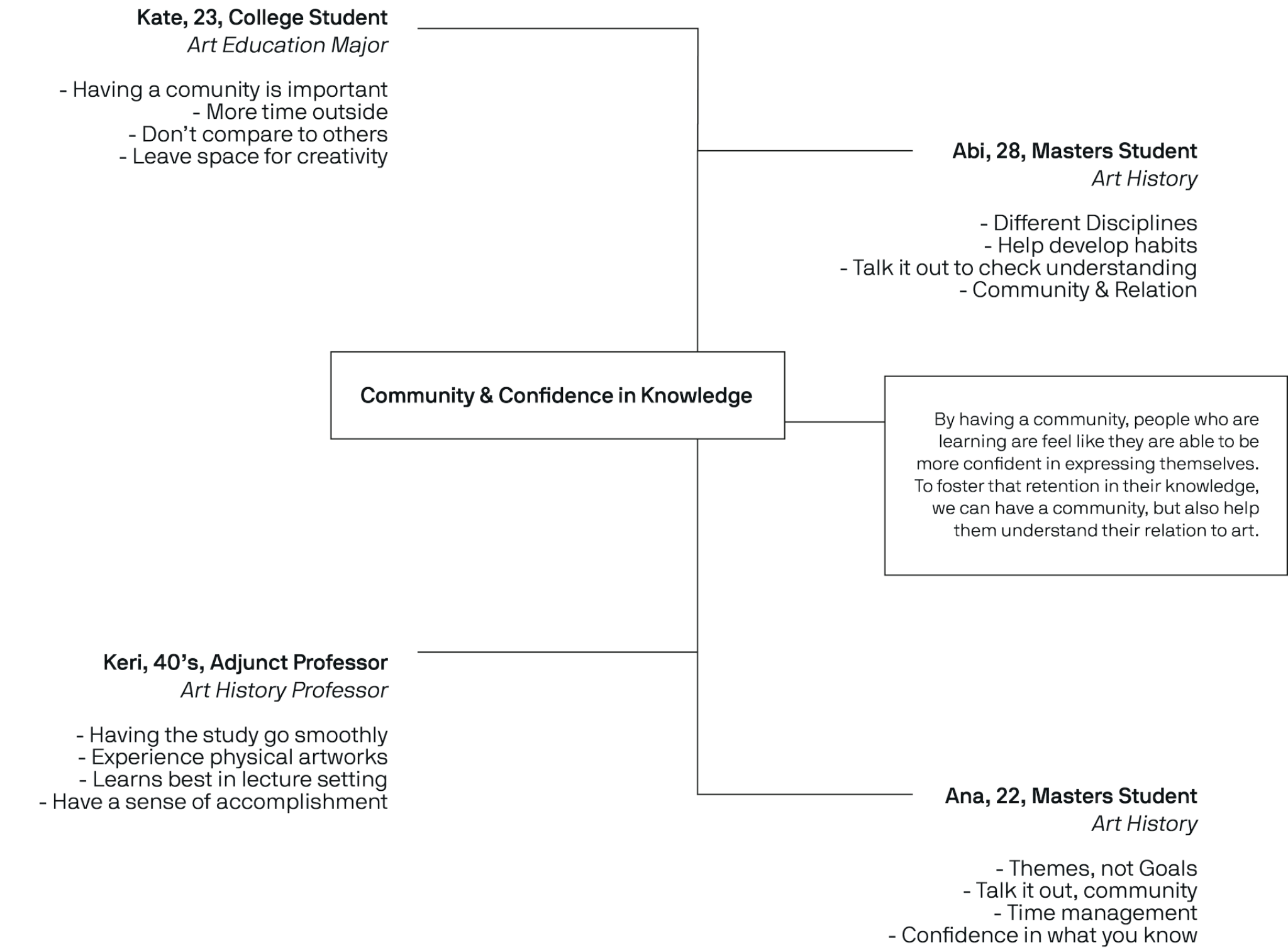
While taking an art history course I realized that there was a deficit in ways to study for, specifically, art history. Although there were flashcards and quizzes, what I wanted was a way to develop my skills of identifying key characteristics and terminology throughout art pieces. This then drove me to research and interview other students, professors, and people interested in art history to see if they had similar experiences.
Defining the System.
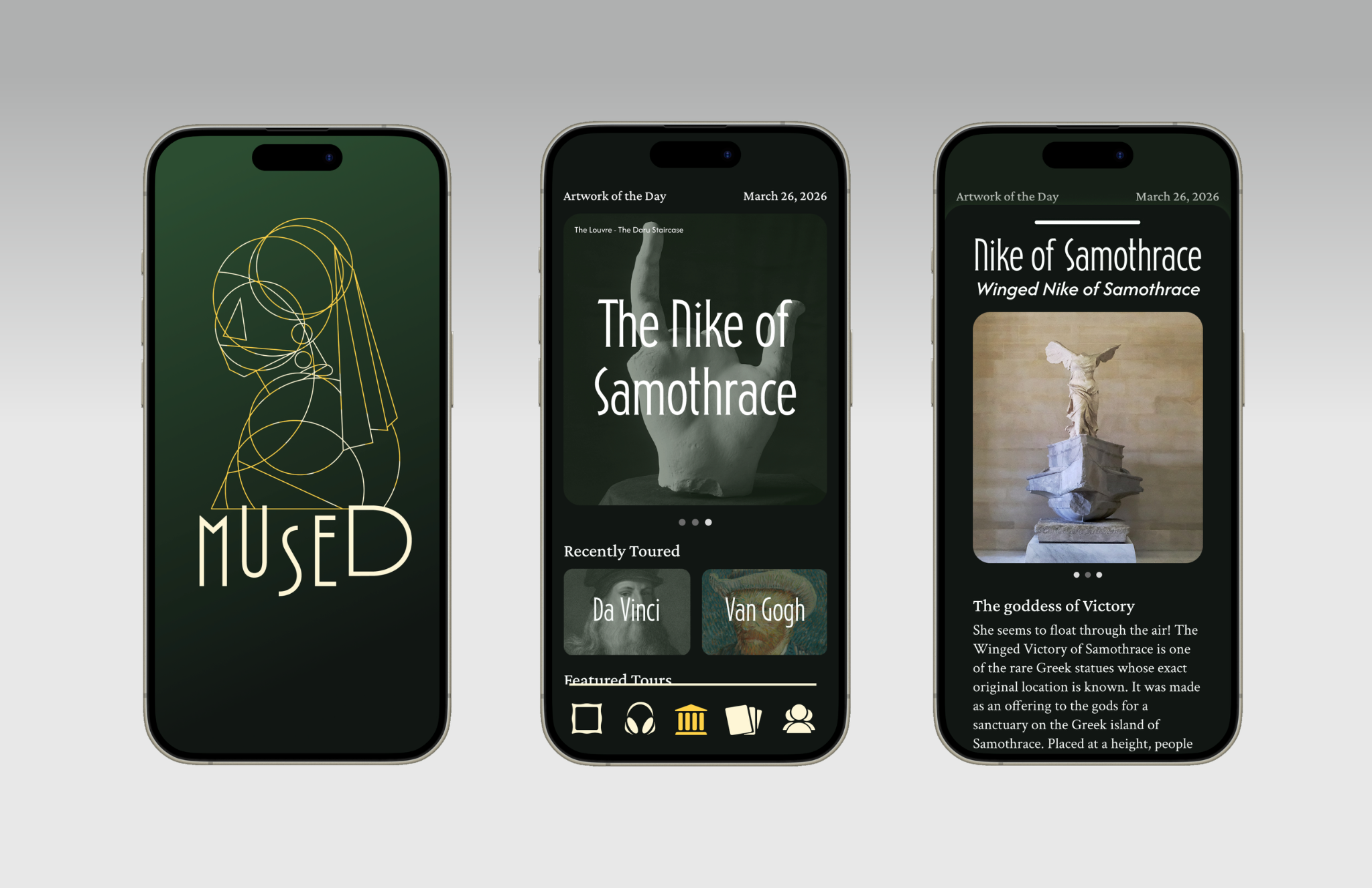
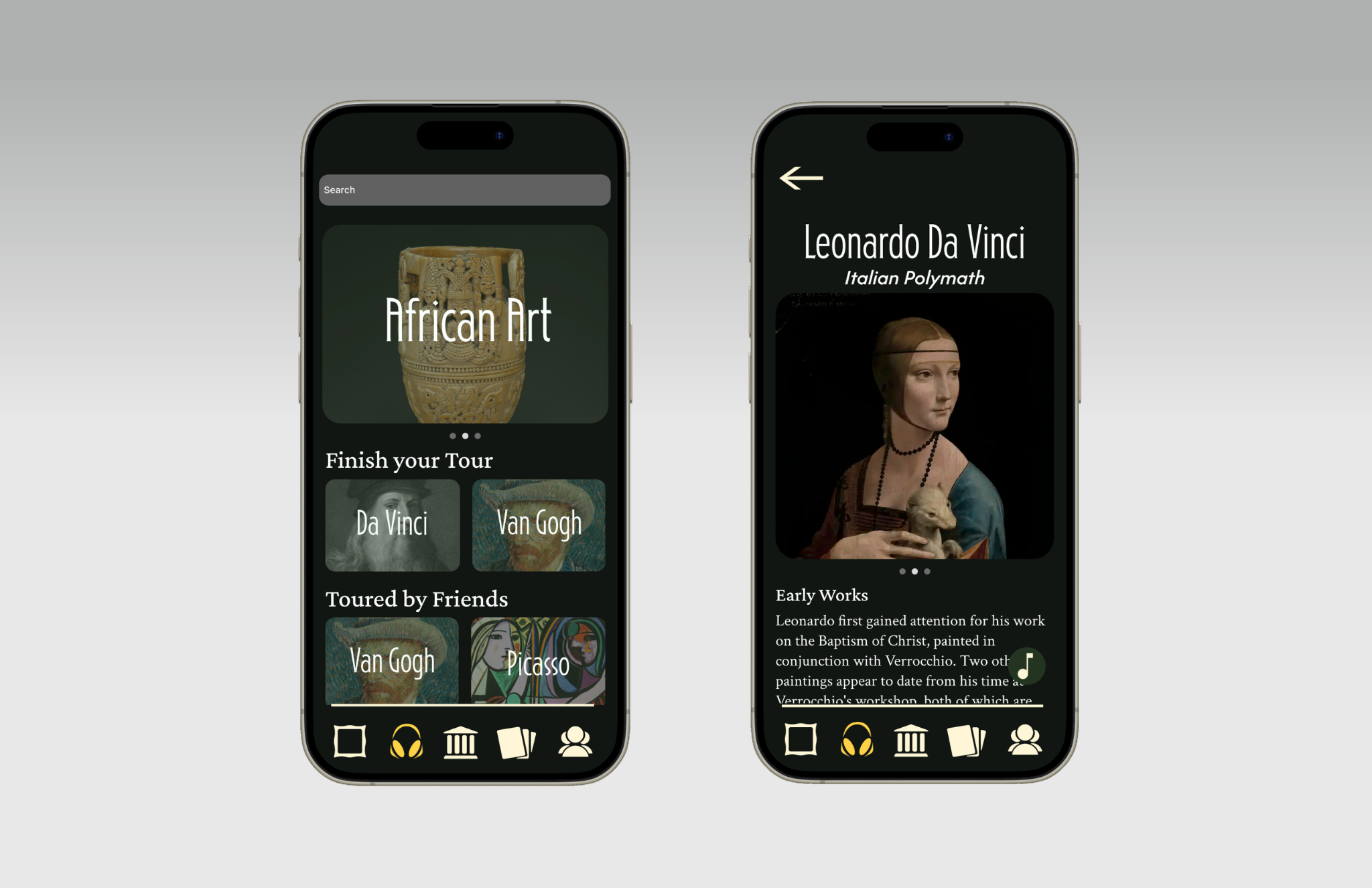
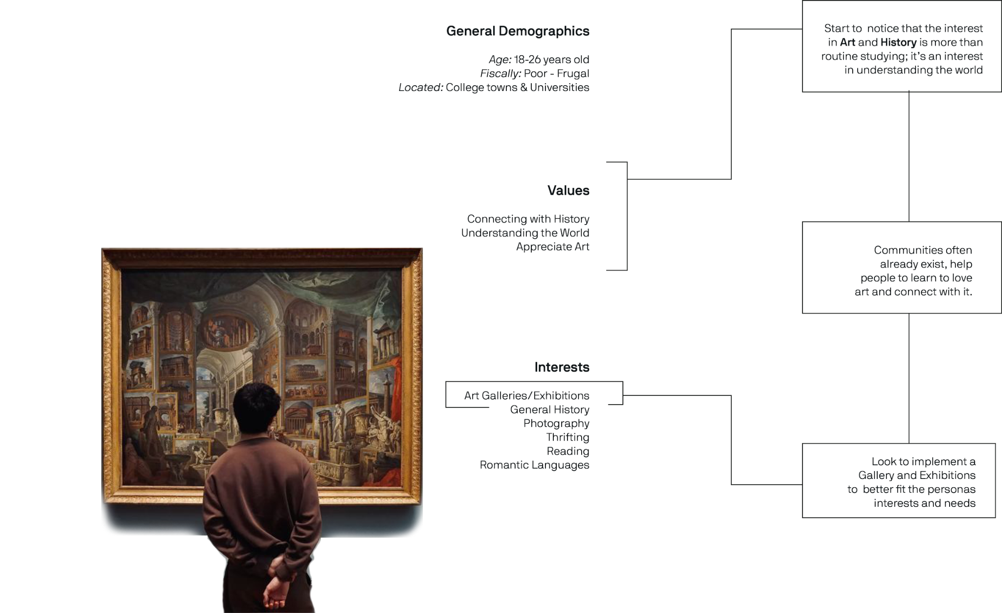
Despite recognizing the need for a better study tool, when further looking to define the audience for this app, I realized that I had created too niche of an audience, preventing myself from allowing people outside that specific niche to use the app. This then drove me to change the direction of the app by focusing on a way for people to be exposed to art; I decided this app would be a way to increase visual literacy. This idea was then a way for museums to interact with the public by publishing retired exhibits to the app, as well as audio tours. If the public learns about an artwork, then they're naturally more inclined to be excited to see it as well as look for opportunities to visit the museums. Increased traction in the app; increased traction in the museums.
Developing the Imagery.
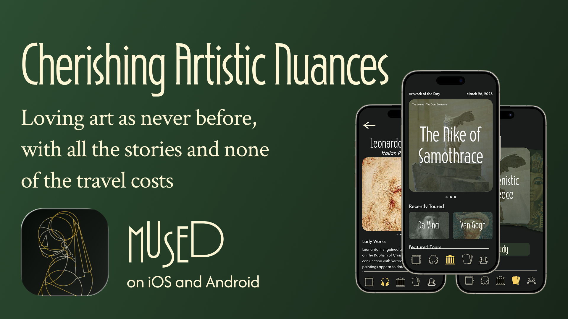
When considering how I wanted to display this app, I decided on employing an art deco stylization, especially for the title fonts, that was then accented by a sans-serif header, and serif body copy. When creating the logo for Mused, I decided on making an art deco inspired iteration of a famous work. When considering the other apps available, as well as notable art piece, I found that the woman with the pearl earring was recognizable but not often employed. This quickly became the logo, complimented by a custom icon series and a green/gold color palette.